POSTER DESIGN
This is a series of posters made by Ismael Beltran. I really enjoy making posters because its the entire designs process done expressly. I get to concept ideas, come with overall theme, figure out who my audience is, figure out how the audience will interact with it, and most importantly figure out what to do with negative space.
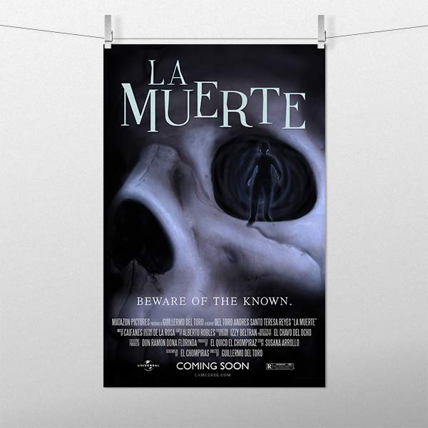
La Muerte
The idea behind this concept poster was to come up with a movie and make a poster for it. I created every asset for this poster. I got into a studio and photographed the skull and one of my friends while backlighting him. The rest of the poster was finished in Photoshop.
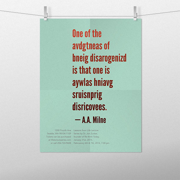
Lesson From Life Lecture
This poster was a poster for a lecture event. I took a quote from 3 that they had and made a poster capturing the essence of the quote while keeping it interesting. The design was based off of the study done at Cambridge University’s Cognition and Brain Sciences Unit, where you can still read a word even though the letters might be scrambled(or transposed). I also used a complementary color pallete to make the letters stand out more. I had alot of fun making this poster and the outcome was just what I wanted.
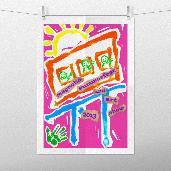
Magnolia Summer Fest
This was a fun poster to make. Since it was for a kids event I took out the acrylic paint bottles and started finger painting. My two year old nephew helped me with some of the paint work.
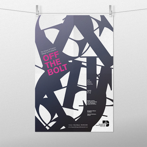
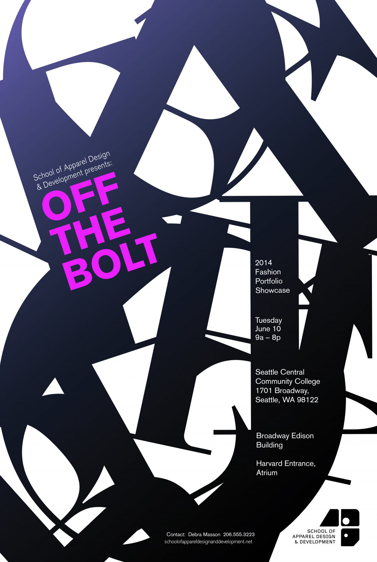
Off The Bolt
I was one of the finalist to a poster contest for the apparel design school program. I got to pitch my idea in front of the apparel design panel.
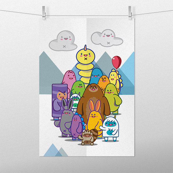
The Monster Mash
I wanted to illustrate an entire poster. The idea behind this poster was that I wanted people to smile as soon as they looked at this poster. I user tested it and 100% of the people I showed couldn’t help but smile. I also posted this on a wall and watched people walk up to it. I guess the bright colors and Chibi art worked.

