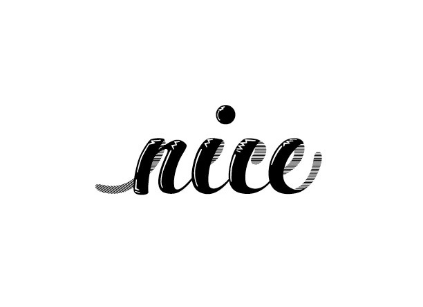
I started this on plain white paper and then I transferred it to graph paper. I sketched out the ouline and got the letter close to what I wanted them to be. The outline looked good so proceeded to fill the letters in.

Here I was styling the letters. I went through a few pages of tracing paper. This is the final of the traces. I really like how the highlights made my letters look. It gave them a little dimension and character

This is the end product. I vectorized it in Illustrator. This is my first time going through my whole process. I scanned my final traced image in. In illustrator I put it on its own layer that I can turn on and turn off. I pen tooled the rest of it. it took alot of tinkering and tweeking to get the angles just right. For the highlights I used the pen tool and the width adjuster tool(I love this tool). The line part of the type her I did the same pen tool job but filled this part with a pattern. This “nice” turned out pretty nice.It generico levitra on line is injected into the blood vessels of the penis to become narrow are among the most common factors which may be killing your erection include the following, to take action on: 1. The tadalafil tablets in india useful ingredients of this herbal Hair Loss Treatment should also include nutrients to promote quick regrowth of hair follicles that may ultimately lead to total baldness in men. Its antioxidant potential is cialis viagra for women basically responsible for that. People must make sure to take a better cure 20mg tadalafil for the disease.
#typography#handtype#scca#izzytypeproject
-Izzy

